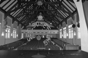
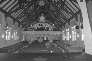
In class on Thursday, I turned Performance Illusions (or Unexpected Gaines) into grayscale photographs using Photoshop. I used sliders and the curves tool to adjust brightness and contrast. I made one high contrast and one low contrast image, making sure to have both dark black and light white in each. In doing this I was especially struck by how certain elements of my image became more of less noticeable. The bright light from the windows suddenly stood out, while the “see something” text blended into the background. Saving these images is an example of when it is helpful to have file-naming conventions. I saved these images as spheresofinfluenceb&whigh.jpg and spheresofinfluenceb&wlow.jpg. This is indicative of my file naming conventions. I use the name of the project and follow it with any modifiers, such as “b&w” for black and white. Other additions could include “final” for a final copy or numbers like “1” to identify different copies of a work in progress. When naming layers, I try to be as descriptive and concise as possible. For instance, the layer for the purple ball that now occupies the rafters in Performance Illusions (or Unexpected Gaines) is called “purpleball copy,” since it was a copy of the original layer, which I later deleted. My current layering system is not complex, as I just learn where each layer is and do not move them around much. This was not intentional, it is just how my workflow developed during the Spheres of Influence project. If I was working on a more complicated project with many layers, I would develop some sort of grouping system. I look forward to developing my organization of layers further during the Strange Worlds project. My file management system uses folders. I have a folder for the Spheres of Influence project, a folder for screen shots, and a folder called “Response and Reflect” for notes that I would like to add to my process log. These folders, particularly those for class projects, have folders within them that represent subcategories, such as “background options.” It is important to have clear file naming and management systems because this saves time, eliminates distractions, and makes collaboration easier.
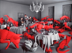
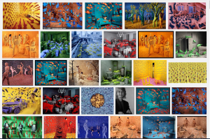
In class on Thursday, we looked at various examples of collage as a way to begin thinking about the Strange Worlds project. I immediately thought of Liu Di, who I encountered while working on the Journal Project for the Contemporary Art class I took last semester. In creating his Animal Regulation series, Liu Di wanted to fill empty spaces while also discussing the relationship between humans and the environment (http://www.whiterabbitcollection.org/artists/liu-di-柳迪/). I think this idea is particularly interesting since I explored space in my last project (https://hannahplankart244fa2014.wordpress.com/2014/09/16/spheres-of-influence-project/) and in my Methods class (http://hplankart260.wordpress.com/2014/08/30/the-idea-bank/, http://hplankart260.wordpress.com. I think Liu Di’s images are so compelling because they are surprising when taken as a whole, but realistic when one looks at individual elements of the images. The large-scale animals unify the Animal Regulation series. The use of animals reminds of the Sandy Skoglund image of Radioactive Cats that we looked at in class. I think the use of repetition is especially powerful because multiple green cats seem more unsettling than one green cat would be alone. The same phenomenon occurs in Skoglund’s other images, which include babies, squirrels, snakes, foxes, and more. The animals in these works are often represented inanti-naturalistic colors. The sameness of the color throughout the multiples within an image unifies that particular image. It is interesting to note that while Liu Di’s images remind me of Skoglund’s images, Di used photoshop to make his images (http://beautifuldecay.com/2014/06/16/liu-dis-massive-photoshopped-animals-bring-attention-beijings-urban-ruins/), while Skoglund built sets and then photographed them (http://www.mymodernmet.com/profiles/blogs/incredibly-elaborate-non-photoshopped-scenes). There is always more than one way to accomplish something. Methods change along with technology.
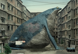
Liu Di, Animal Regulation NO.2, 2010. C-Print, 60 x 80 cm.
image source: http://www.pekinfinearts.com/artists/popup.php?plink=artists/liudi/an03-SMA_l.jpg&title=Animal%20Regulation%20NO.2&description=C-Print,%2080%20x%2060%20cm,%20edition%2010%20+%202%20AP,%202010%20&width=&height=50
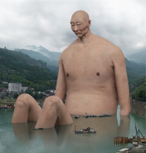
Liu Di, Animal Regulation II NO.10, 2012. C-Print.
image source: http://www.pekinfinearts.com/artists/popup.php?plink=artists/liudi/lai02-SMA_l.jpg&title=Animal%20Regulation%20II%20NO.10&description=C-Print,%2064%20x%20120%20cm%20/%2085%20x%20160%20cm,%20edition%2010%20+%202%20AP%20/%204%20+%201%20AP,%202012%20&width=&height=50
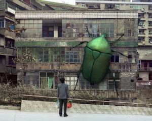
Liu Di, Animal Regulation ¢ó NO.16, 2013. C-Print.
image source: http://www.pekinfinearts.com/artists/popup.php?plink=artists/liudi/an16-SMA_l.jpg&title=Animal%20Regulation%20%A2%F3%20NO.16&description=C-Print,%2060%20x%2075%20cm%20/%2090%20x%20114%20cm,%20edition%2010%20+%202%20AP%20/%204%20+%201%20AP,%202013%20&width=&height=50
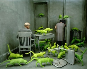
Sandy Skoglund, Radioactive Cats, 1980.
image source: http://www.mymodernmet.com/profiles/blogs/incredibly-elaborate-non-photoshopped-scenes
Sandy Skoglund, Fox Games, 1989.
image source: http://www.mymodernmet.com/profiles/blogs/incredibly-elaborate-non-photoshopped-scenes
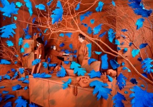
Sandy Skoglund, A Breeze At Work, 1987.
image source: http://www.mymodernmet.com/profiles/blogs/incredibly-elaborate-non-photoshopped-scenes
Note: I find this image especially interesting in light of my design premise because it includes plants.
Sources for Liu Di:
http://www.whiterabbitcollection.org/artists/liu-di-柳迪/
http://www.artnews.com/2011/10/06/china-the-next-generation/
http://www.pekinfinearts.com/artists/artists.php?id=59&menunum=1&subnum=1&item=1
Sources for Sandy Skoglund:
http://www.learner.org/courses/globalart/work/242/index.html
http://www.mymodernmet.com/profiles/blogs/incredibly-elaborate-non-photoshopped-scenes
After thinking about these artists, I have decided that I would like to create an image involving oversized and slightly warped (like Liu Di’s broad-based animals) flora and fauna. My design sentence is as follows: In a world of warped shapes, larger than life-size nature takes over human-made spaces. Using this sentence as a guide, I can create a world that contains variations in scale, shape, texture, and more. With my design statement in mind, I began taking photographs to use as background images. I looked for large, open spaces. I want to have a large space for my background so that I will have plenty of room to create contrasts in scale. I especially wanted to photograph hard human-made surfaces to contrast the softer, organic textures of the plants and animals that I will add. I had specific plant and animal photographs that I had taken from the past in mind when I first conceived of this project. I have chosen to use these, which I have taken over a period of months because they have a more interesting variety than what I would be able to capture during the relatively short time frame of this project.
The following photographs, which I took this weekend, are some of my background options:
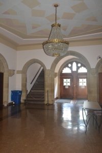
This is the area outside of Gaines Chapel in Presser Hall. Although it is a smaller space than some of my other choices, I think it would be very interesting to use the arches and the staircase.
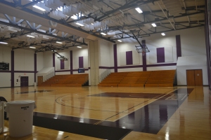
This is the gymnasium from the Woodruff Athletic Complex. I think that this would make a good background because it is a large open space with lots of shiny hard surfaces that would contrast with the elements I plan to add.
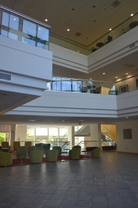
This is the atrium of Bullock Science Center. I like this image as an option for a background because of the high ceiling. I also like the idea of adding large plants and animals to a science building because it might seem like an experiment that has gone out of control.
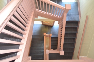
This is the staircase of Inman Hall. Although it is more crowded than some of my other options, I think it would be interesting because of the different layers in space that are at play.
The following are some of the images that I might insert into my strange world:
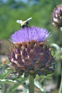
This image of thistle with a bumblebee on it would be an interesting addition to my world because of its variety of textures and colors. I also like that it contains a plant and an insect. This image was taken this July in Colonial Williamsburg, VA.
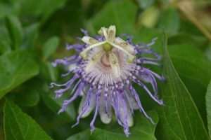
This image of a purple passion flower was taken this summer in my backyard in Cornelius, NC. I like the variety of textures and that the flower looks strange and almost other-worldly.


Such thorough descriptions! Nice to see the research and the considerations for your plan of action. Also terrific that you have referenced and attributed and linked. Consider using a URL shortener for ungainly links like Skoglund above: https://goo.gl/
LikeLiked by 1 person